nabo
Nabo is an independent publisher dedicated to photobooks and editorial experimentation, focusing
on limited-edition and contemporary books while maintaining a casual and close approach.
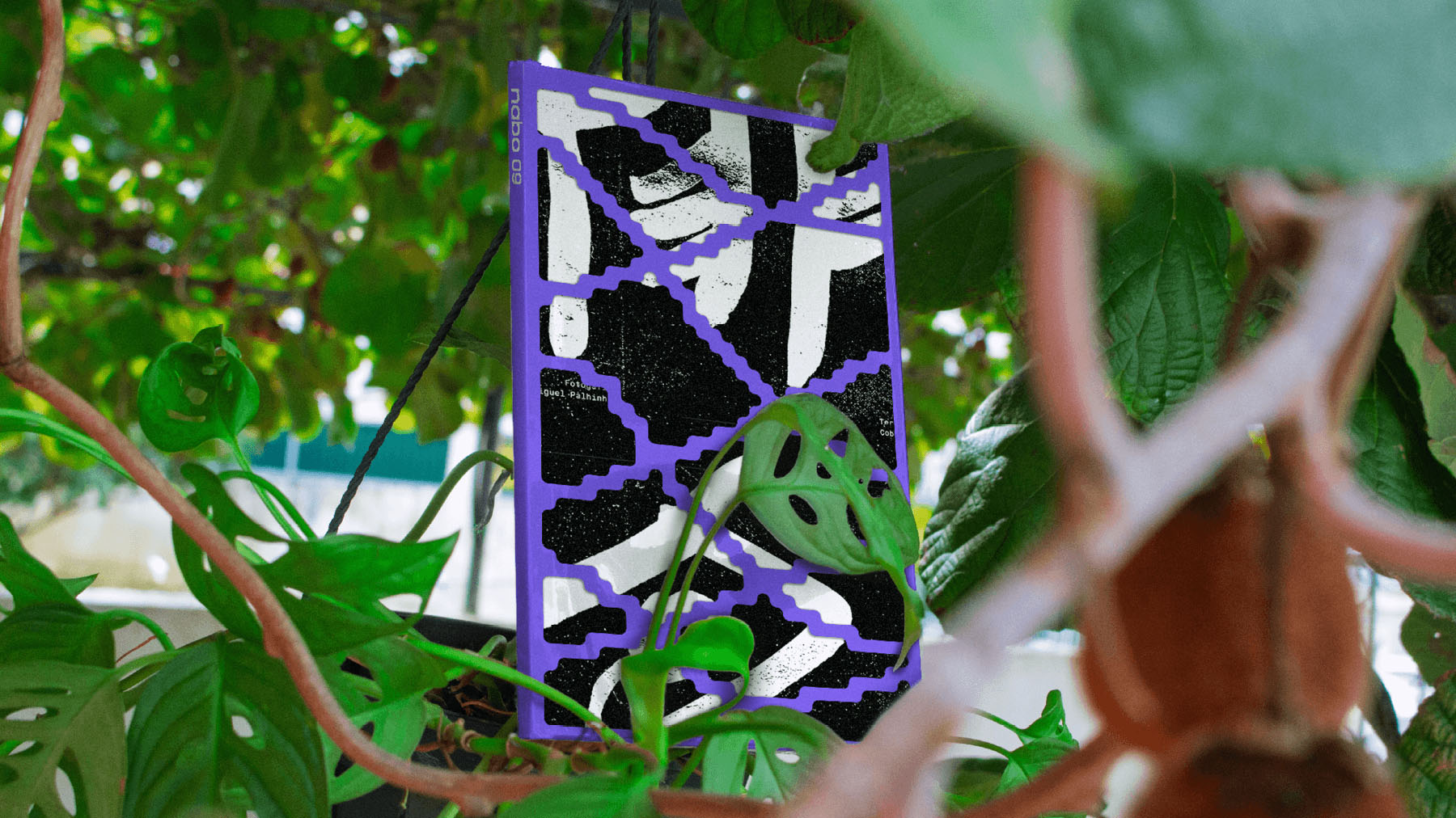
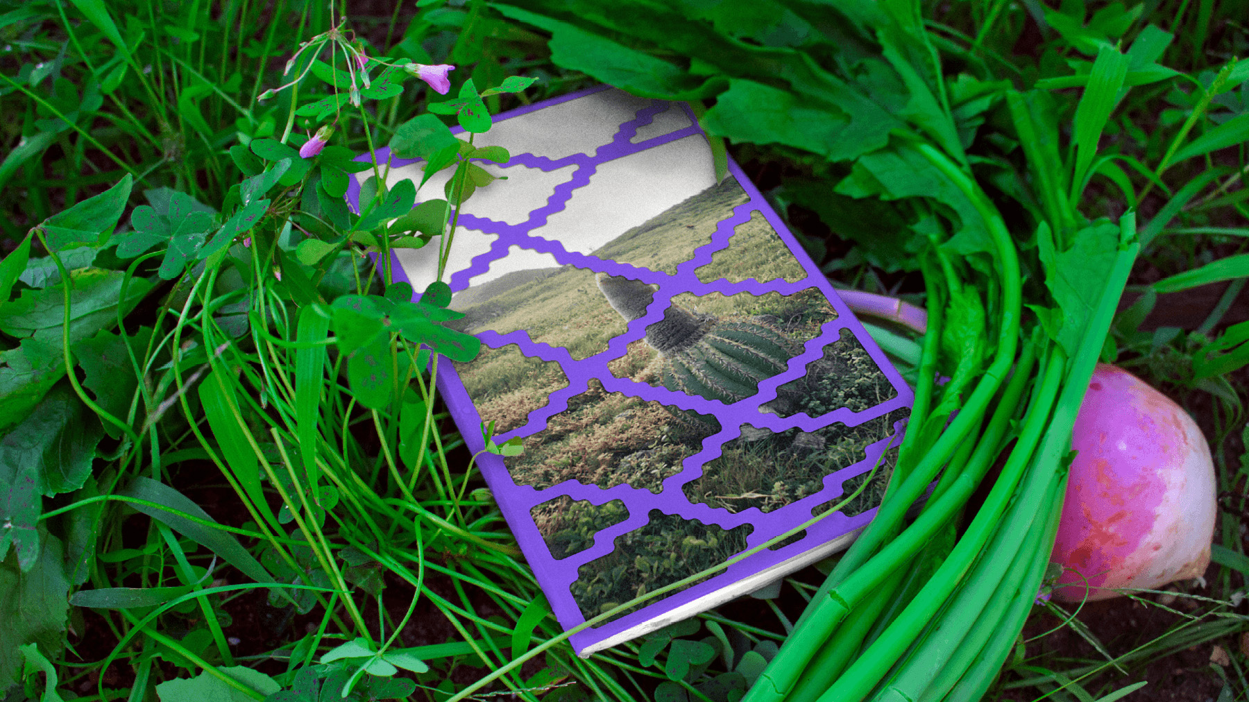
The main objective was to create a visual identity that avoids any kind of institutional or serious look. My approach reflects the publisher’s raw personality instead of just decorating it, using a custom modular typeface “circular squares” built entirely from a geometric grid. Additionally all communication materials were presented through real photographed mockups.
The main objective was to create a visual identity that avoids any kind of institutional or serious look. My approach reflects the publisher’s raw personality instead of just decorating it, using a custom modular typeface “circular squares” built entirely from a geometric grid. Additionally all communication materials were presented through real photographed mockups.